
Graph Visualisation
This documentation explains the types of vertices on an HDA graph visualisation and all the functionalities that it provides.
Overview
The example below shows a typical graph visualisation in the HDA portal, showcasing various types of vertices interconnected through specific relationships. The dataset that's currently being viewed is highlighted for easy identification. At the top-right side of the visualisation, you'll find multiple operational buttons to interact with. To explore the graph further, you can double-click on any vertex or hover your cursor over them. This documentation provides an introduction to the different types of vertices, the information accessible through the graph, and various methods to interact with it.

Fig 2.1 An example of the graph visualisation
Types of vertices
Vertex | Description |
 | A health dataset |
 | A Person |
 | An Organisation/institution or group of people. |
 | A Publication |
 | Primary vertex. |
 | A Cluster. |
Note: Vertices can represent objects which do not exist as a record in Health Data Australia e.g. a publication vertex representing a related study
Expand and collapse the graph visualisation
By default, the graph visualisation is collapsed for a more concise page view. To expand the graph visualisation, simply hover the cursor on the graph visualisation section, and you will see a pop-out message saying "Click to explore relationships graph". Your cursor will also transform into a hand shape. By clicking anywhere on the graph, it will expand to display the vertices and relationships.
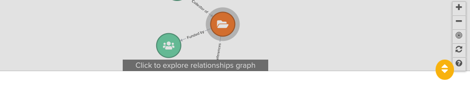
Fig 2.2 The pop-out message on the graph visualisation
To collapse the graph visualisation, simply click the round orange button with a bi-directional arrow at the bottom-right corner.
Repositioning the graph
To reposition the graph to any desired position:
Click and hold your left mouse button down on any white area of the graph canvas.
Drag the canvas to the desired position.
Release the left mouse button.
you can also click the Fit-to-Window button to centre the entire graph and ensure that it fits perfectly within the window.
To remove all the changes and reset the graph, click the Reset button.
Zooming in & out
If you have a mouse with a scroll wheel, you can use it to zoom the graph view in and out. The graph will zoom in and out from the location of the mouse pointer, allowing you to zoom into specific parts of the graph by positioning your pointer over the area of interest and then scrolling.
If you don't have a mouse with a scroll wheel, you can still zoom the graph view in and out using the zoom buttons. Use this method in combination with the 'Repositioning the graph' instructions to achieve the desired view.
Highlight a vertex's relationships
To highlight a vertex's relationships, simply hover your mouse pointer over the vertex. This will grey out any vertices which are not directly related.
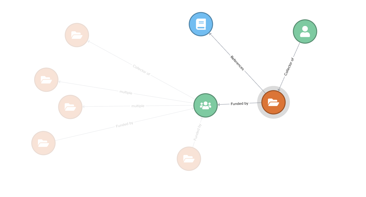
Fig 2.3 The highlighted relationships of the primary vertex
Expanding a vertex's relationships
Single non-primary vertices often have relationships to vertices that are not directly related to the primary vertex (the record being viewed in Health Data Australia) and are therefore not initially displayed in the graph view. To load additional relationships, double-click on a single vertex. A processing icon will be displayed while the system attempts to load any additional relationships. If no relationships exist for the clicked vertex the current graph view will simply refresh.
Viewing the type and title of a single vertex
To view a vertex's type and title, hover your cursor over the vertex. This action will trigger a tooltip displaying the respective values. Where a health dataset exists in Health Data Australia, the title of the vertex will be displayed as a hyperlink. Simply click the link to view the information about the dataset in HDA.
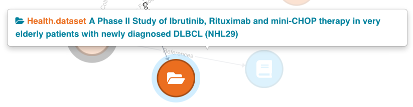
Fig 2.4 The tooltip for a health dataset vertex
The tooltip for the related study vertex also includes a hyperlink. The difference is that clicking on this link will redirect you to an external page outside of HDA, where you can view detailed information about the study.
For other types of related objects in the graph, such as person and organisation record types, only the name of the record will be shown in the tooltip.
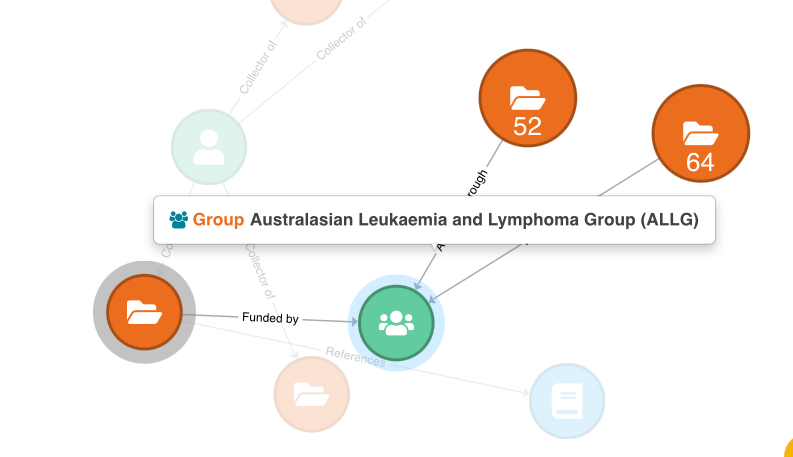
Fig 2.5 The tooltip for an organisation vertex
Viewing the relationships between vertices
To view the relationships between 2 vertices, hover your mouse pointer over the connector. This will display a tooltip with the relationships.
If the text on the connector says "multiple," it indicates that the two vertices are linked through more than one relation. An example is provided below to illustrate the relationships between an organisation and a dataset. In this case, the dataset is both funded by and available through the organisation it points to.
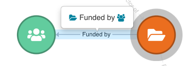
Fig 2.6 The relationships between an organisation and a dataset